Lowcountry Color Palettes That Actually Work

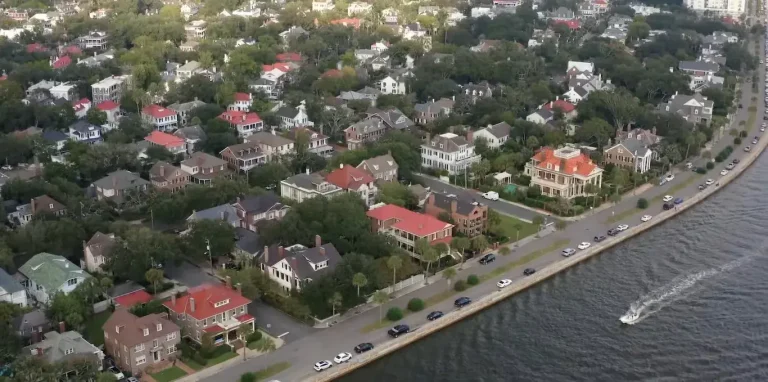
Choosing paint colors for a Charleston home is different from selecting colors almost anywhere else. The light here is intense, warm, and direct. Colors that look perfect on a chip or in a northern showroom often shift dramatically once they hit Lowcountry walls.
Cool bluish whites can read sterile or faintly blue under afternoon sun. Bright greens feel out of place. Stark contrasts that work in other climates can look harsh against the soft, golden quality of coastal light. The palettes that succeed draw from the landscape itself: oyster shells, marsh grass, tidal water, and sun-bleached sand.
These are not generic coastal colors. They are specific to this place. When chosen well, they feel as if they have always belonged in the home.
Why Lowcountry Light Changes Everything
South Carolina coastal light has two distinct personalities. Midday sun is strong and overhead. It pushes colors toward cooler casts and can bleach mid-tones. Morning and afternoon light is warmer and longer. It pulls colors richer and more saturated.
A color must work in both conditions. Many failures happen because homeowners select colors under indoor lighting or from online images taken elsewhere. Testing full-size samples on the actual walls at different times of day remains the most reliable method.
Warm-toned woods common in Charleston homes, such as white oak and heart pine, further influence how wall colors appear. Always view paint samples against the real flooring and trim in the space.
The Foundation: Warm Whites and Oyster Creams
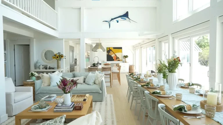
The most successful Lowcountry interiors start with a warm, complex white rather than a cool or optically bright one. These whites carry the softness of bleached oyster shells and sunlit sand. They stay livable in strong light without turning yellow or sterile.
Reliable options that local professionals return to repeatedly include Benjamin Moore White Dove (OC-17) and Sherwin-Williams Alabaster (SW 7008). Both hold up across seasons and lighting conditions. Slightly deeper warm creams or soft greiges can add quiet depth on accent walls or in rooms that need more weight.
Cool, bluish whites that dominated many interiors several years ago often feel less at home here. They can appear flat or harsh once the afternoon light hits them.

Marsh Greens and Soft Sages
Muted, gray-tinged greens drawn from Spartina grass, Spanish moss, and live oak shadows bring the landscape indoors without looking trendy. These greens read as soft neutrals in strong light and deepen gracefully in shade.
They work especially well on cabinetry, accent walls, or in rooms that open to marsh or garden views. Brighter or more saturated leafy greens tend to feel imported rather than native. The most successful versions stay complex and slightly gray rather than pure or vivid.
Warm Neutrals and Sand Tones
Warm taupes, sandy beiges, and soft earth tones ground a room without cooling it down. These colors reference low-tide sand, dried winter marsh, and tabby walls. They pair naturally with wide-plank wood floors and natural textures.
Cool gray-based neutrals can feel disconnected from Charleston light and materials. Warmer versions sit more comfortably alongside heart pine, white oak, and the golden quality of the afternoon sun.
Tidal Blues and Deeper Accents
Lowcountry blue is rarely bright aqua. It tends toward deeper, slightly green-tinged tones that recall the waterways at dusk. Used with restraint on an island, front door, or single accent wall, these blues add confidence without overwhelming the space.
Deeper, moodier tones have also found a place in dining rooms and libraries. When paired with warm whites and natural materials, they create contrast while remaining rooted in the regional palette.

Practical Palette Combinations That Perform
Classic Warmth
Warm oyster white on walls, soft sandy taupe or deeper cream on accents, natural wood floors, and unlacquered brass. This combination has looked right in Charleston homes for generations because it responds to the light and materials already present.
Marsh-Inspired
The same warm white as an anchor, muted sage or gray-green on cabinetry or an accent wall, creamy stone surfaces, and warm metal finishes. The green stays complex rather than bright, so it feels native rather than decorative.
Quiet Contrast
Warm white walls, soft warm gray on secondary surfaces, and restrained darker accents on trim or hardware. Wide-plank flooring and natural stone carry the warmth while the paint stays calm and architectural.
These combinations work across historic single houses, newer construction, and waterfront properties when the specific hues are tested in the actual rooms.
Common Mistakes to Avoid
Selecting colors only from small chips or online images is the most frequent error. The light here changes how every shade behaves. Full-scale samples observed throughout the day prevent most disappointments.
Overusing cool whites and crisp blue-grays can make rooms feel less connected to the surrounding landscape. Heavy reliance on bright or saturated coastal clichés often ages quickly and can feel themed rather than authentic.
Ignoring the influence of existing wood floors and trim leads to mismatched undertones. Always coordinate paint decisions with the materials already in the home.
How to Test Colors Successfully
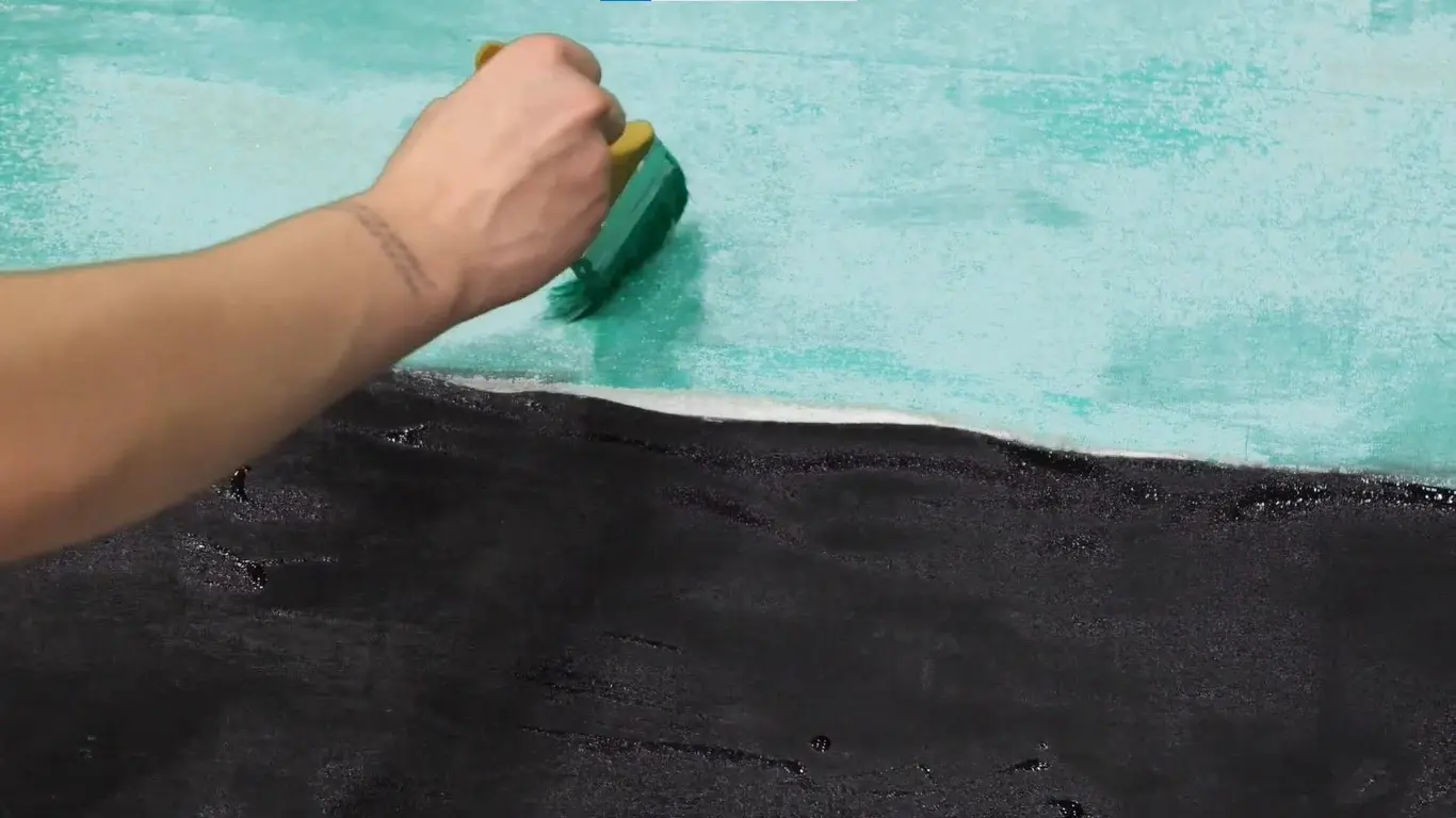
Paint large sample boards or use high-quality peel-and-stick samples. Place them on multiple walls in the room. Observe them in morning light, midday sun, and late afternoon. Live with the samples for several days if possible.
Consider the direction the room faces. South- and west-facing spaces receive stronger, warmer light that shifts colors more dramatically. North-facing rooms behave differently and may support slightly different choices.
View samples against the actual flooring, cabinetry, and fixed finishes. The interaction between paint and existing materials determines whether the final result feels cohesive.
Color and Long-Term Performance
In a humid coastal climate, paint performance matters as much as appearance. Premium interior and exterior formulations designed for moisture resistance hold up better. Proper surface preparation and application remain essential regardless of color choice.
Lighter and mid-tone colors generally show less dramatic fading and weathering on exteriors than very dark saturated hues, though thoughtful darker accents can still succeed when quality products are used.
Bringing It Together
The Lowcountry palettes that last are not trend-driven. They respond to the specific light, landscape, and materials of this region. Warm whites, complex marsh greens, sandy neutrals, and restrained broader accents create interiors that feel calm, rooted, and appropriate.
When colors are chosen with the actual conditions of the home in mind, the result supports both daily living and the architectural character of Charleston. Testing thoroughly and favoring warmth over coolness produces the most reliable outcomes.
Ready to Choose Colors That Work in Your Charleston Home?
Selecting the right palette requires understanding how Lowcountry light and materials interact. If you are planning a paint project or full interior update, we can help you test and refine choices that belong in your space. Contact us to discuss your home and goals.